[Side Project] Designing a Unified Operations Platform for Airline Pilots and Ops Teams
Pretend client: Airline Integrated Operations App

My Role & Contribution
In this pretend project, I owned the discovery-to-delivery workflow for an integrated ops tool that streamlined fragmented airline systems into one interface. I translated cross-functional needs into scalable UX while navigating MUI3 limitations, legacy UI debt, and high-stakes aviation use cases.
Role: Lead UX Designer
Scope: Led UX from research through prototyping and visual design across desktop, iPad, and mobile
Focus: Modular UX, responsive behavior, accessibility (WCAG AA), night mode, system-based design
Collaboration: Product Owner, Engineers, Solutions Architect, Delivery Manager
🧐 Framing the Problem
Pilots, Airport Ops, and the Operations Center juggled multiple tools and sources to manage flight schedules, connections, baggage, and aircraft readiness. This fragmented experience created delays in communication, cognitive overload, and manual errors that impacted on-time performance and passenger experience.
There was no single source of truth. A simple gate change or missed connection required digging through 3–5 systems to understand the knock-on impact.
🔎 How I Gained Clarity
I collaborated with the Product Owner and Solutions Architect to define primary user personas, their goals, and the key delay-prone moments across a typical passenger journey.
Key Personas:
Pilots – need real-time visibility into flight readiness, under-wing status, and schedules
Airport Ops – need manual PTS overrides, timestamped updates, and better visibility of boarding issues
IOC Teams – need to monitor flight status, respond to connection risks, and coordinate across ports
Insights:
Multiple data sources = fractured context
Lack of hierarchy = slow scanning and missed info
UI lacked responsiveness and semantic structure
I also studied dense UI patterns and information architecture models to guide our layout, progressive disclosure strategy, and component grouping.
“We need an easier way to keep information on our finger tips. Too many devices and apps can get confusing and distracting."
— Regional Airline Pilot
🧰 My Approach
I focused on clarity, modularity, and system scalability:
Reframed interface structure using progressive disclosure and glanceable UI for iPad and mobile
Introduced clear typographic hierarchy, reduced visual clutter (unnecessary shadows, padding mismatches)
Designed touch-first layouts with consistent tab interaction models
Consolidated repeatable patterns into a component-based approach aligned with MUI3
Improved scannability through layout simplification, grouping logic, and use of color for critical states
While foundational UI improvements were constrained by time and legacy decisions, I delivered iterative upgrades that balanced delivery speed with long-term UX value.
🛠 Final Design Solution
Summary of UX changes:
Prioritised view of flights requiring urgent intervention
Color-coded manual/auto events, delay codes, and baggage triggers
Maintains function during tarmac and flying time blackspots
Aircraft-specific ops view with tail filtering/navigation
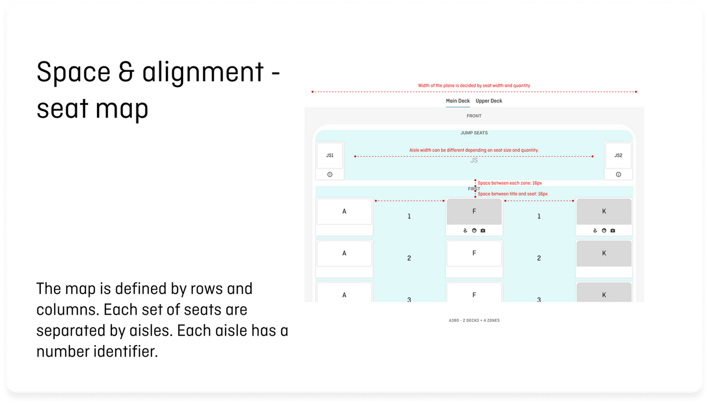
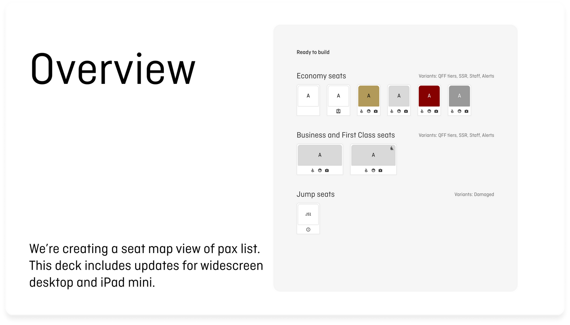
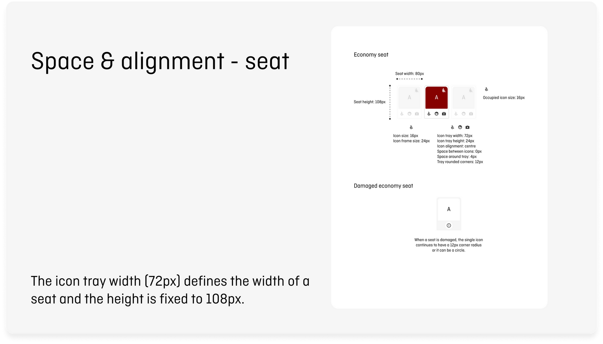
Cabin Totals & SeatmapVisibility into passenger loading, onloads, and staff upgrades
TSAT/TOBT highlighting, disruption reasons, zone summary
Optimised layouts for mobile, tablet, and desktop, including landscape and portrait iPad views
📊 Outcomes & Impact
Reduced decision-making friction by unifying ops data into a single platform, reducing the need for multiple devices
Improved clarity and hierarchy helped reduce support reliance and cognitive load during IROPs
Increased tool reliability and accessibility across desktop, iPad, and mobile, supporting glanceable and touch-based use
Enabled real-time event tracking from pilots, enhancing operations visibility
Constraints:
MUI3 library limited visual flexibility
Legacy foundations and inconsistent Figma/code parity slowed design system improvements
Next Steps:
Continue extending systemic patterns across modules
Improve micro-interactions and animations for scanning
Advocate for foundational redesign and shared library governance
🧐 Learnings
Mental model alignment across stakeholders unlocks better systems thinking
Small layout and hierarchy shifts can drive large performance and clarity wins
Balancing design excellence with engineering velocity requires principled tradeoffs


